

Hello lovely readers, and welcome back to averisliving.uk. If there is one room in the house that universally suffers from a bit of design neglect, it is the downstairs loo. Often treated as a dumping ground for winter coats, overflowing recycling bags, and the vacuum cleaner, this tiny footprint is rarely given the aesthetic attention it actually deserves. But I have always believed that these diminutive spaces offer a brilliant opportunity to create a quiet, considered moment of design. A downstairs cloakroom is the perfect place to experiment with mood and texture without committing to a massive, whole-house renovation.
Recently, I tackled a complete transformation of our own rather tired ground-floor washroom, moving away from its cold, clinical origins to something much softer and far more considered. I wanted to prove that you do not need bold, chaotic patterns to make a small space memorable. Instead, by layering warm neutrals, organic materials, and thoughtful lighting, you can create a serene environment that feels incredibly grounded. Today, I am taking you through the entire process, sharing the before-and-after realities, the architectural tweaks, and the high-street sourcing secrets that brought this calming neutral sanctuary to life.
The ‘Before’ Space: Realities, Awkward Layouts & Constraints
Let us talk about the reality of the ‘before’ space, because it is rarely a pretty picture. Our downstairs loo was a classic example of a developer afterthought, squeezed under the stairs with all the charm of a dentist’s waiting room. The walls were painted a stark, brilliant white that somehow managed to make the room feel both chilly and claustrophobic at the same time. A bulky, dated pedestal basin dominated the floor plan, leaving barely enough room to open the door, while a harsh overhead pendant light cast the most unflattering shadows imaginable across the cramped room.
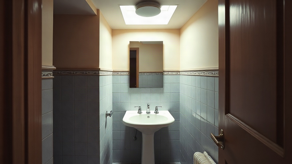
Beyond the aesthetic issues, the layout was incredibly frustrating. The pipework was fully exposed, creating a visual clutter that immediately drew the eye downward to the peeling linoleum floor. Because the space lacked any natural light, the brilliant white paint looked decidedly grey and dingy for most of the day. It was a space you wanted to get in and out of as quickly as possible. I knew that to change the atmosphere, we had to address these fundamental flaws before we could even begin to think about the decorative finishes, paint colours, or pretty accessories.
The biggest constraint, as is so often the case with UK homes, was the sheer lack of square footage. We had to be incredibly strategic about every single millimetre. I spent hours standing in that tiny, awkward footprint, measuring and re-measuring, trying to figure out how to hide the ugly plumbing without losing precious floor space. It became clear that a purely cosmetic update would not cut it; we needed to strip the room right back to its bare bones and rethink the spatial flow entirely to achieve the calm, uncluttered neutral aesthetic I was dreaming of.
Layout & Architectural Fixes
The physical transformation began with a rather messy, dusty demolition phase to correct the awkward layout. To create a sense of spaciousness in such a restricted footprint, we had to get everything off the floor. We ripped out the old pedestal basin and the bulky close-coupled toilet, making way for wall-hung alternatives. This required building out a false wall to conceal the new toilet frame and all the unsightly pipework. While stealing a few inches of depth from an already tiny room felt counterintuitive at first, creating a seamless, flush surface instantly made the space feel significantly larger and far more intentional.
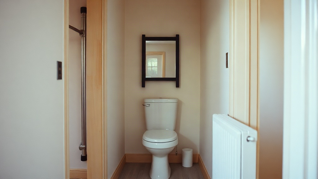
Because we were aiming for a highly curated, visually calming aesthetic, getting the structural specifications right was absolutely crucial. I wanted the new false wall to double as a display ledge for styling, which meant determining the exact height and depth to accommodate both the plumbing and my favourite Farrow & Ball paint finishes. To help you plan your own neutral cloakroom project, I have put together a practical design specification guide below. It details the exact measurements and material pairings we used to ensure the structural changes perfectly complemented our soft, organic vision.
| Design Element | Dimensions / Specification | Paint Code / Finish | Material Pairing |
|---|---|---|---|
| False Wall / Concealed Frame | H: 1100mm x D: 200mm | Farrow & Ball ‘Drop Cloth’ (Modern Emulsion) | Honed limestone shelf top |
| Wall-Hung Vanity Unit | W: 400mm x D: 220mm | Clear Matte Varnish | Solid European Oak & Brushed Brass |
| Skirting & Architrave | H: 120mm (Bullnose profile) | Farrow & Ball ‘Shaded White’ (Modern Eggshell) | Matte ceramic floor tiles |
The architectural fixes extended to the lighting plan, which is arguably the most important element when dealing with a windowless room. We completely eliminated the harsh central pendant, replacing it with a layered scheme. We installed a pair of low-glare LED spotlights on a dimmer switch for practical tasks, and added a soft, glowing wall sconce above the vanity to create a warm, ambient mood. By burying the cables during the plastering phase, we achieved a clean, minimalist backdrop that allowed the upcoming textural elements and neutral tones to truly take centre stage.
The Finished Aesthetic: Palette, Textures & Atmosphere
Once the messy structural work was complete, the true joy of styling began. I wanted the finished aesthetic to feel like a gentle exhale—a masterclass in how neutral tones can be incredibly warm and characterful when layered correctly. We moved away from cold, flat whites and instead embraced a palette of earthy, mushroom tones and soft putty shades. The walls were finished in a specialist natural clay plaster, which adds a beautiful, subtle movement and a tactile quality that flat emulsion simply cannot replicate. It catches the ambient light from the wall sconce beautifully, creating a soft, cocooning atmosphere.
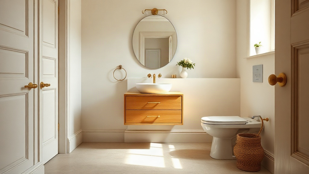
💡 Verity’s Styling Secret: When working with an entirely neutral palette in a small space, contrast is your best friend. Mix matte, chalky walls with warm, reflective metals like unlacquered brass, and pair smooth ceramics with rough-hewn wood. It stops the room from feeling flat and adds a quiet, sophisticated character.
To anchor the space, we chose a textured, large-format porcelain tile for the floor that mimics the look of tumbled limestone. Using larger tiles with matching grout minimises visual breaks, tricking the eye into perceiving a wider floor area. Against the soft, plastered walls, we installed a custom floating vanity crafted from solid European oak. The rich, organic grain of the wood brings a necessary dose of natural warmth to the room, perfectly balancing the cooler tones of the sanitaryware. It is a simple, restrained material palette, but one that feels incredibly luxurious and timeless.
The final layer of atmosphere comes down to the finishing touches. I selected unlacquered brass hardware for the wall-mounted tap and the flush plate, knowing that the metal will gently patinate over time, adding a lived-in, authentic charm to the room. A small, irregularly shaped mirror bounces our soft lighting around the space without feeling too formal or rigid. Finally, a single stem of dried lunaria in a handcrafted ceramic vase on the concealed cistern ledge brings just a hint of organic life, completing a space that feels calm, considered, and beautifully resolved.
Sourcing, Budget Realities & Hard-Earned Lessons
Creating a bespoke, high-end look in a downstairs loo does not necessarily require a lottery win, but it does demand clever sourcing and a realistic approach to your budget. The structural work—moving pipes and plastering—ate up a significant portion of our funds, meaning I had to be quite savvy when it came to the fixtures and fittings. While I splurged on the clay plaster and the solid oak vanity, I saved considerably by scouring the UK high street for beautiful, budget-friendly accessories. It is all about knowing where to spend and where to compromise to achieve that premium aesthetic.
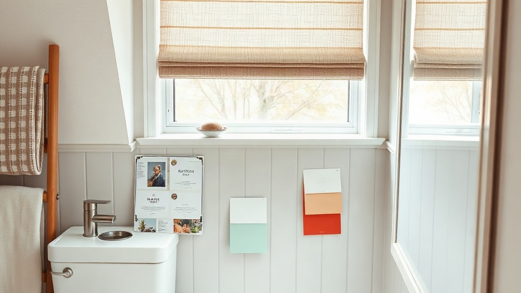
For instance, John Lewis and Dunelm are fantastic resources for affordable, textured hand towels and small ceramic storage jars that look far more expensive than they actually are. I also found that B&Q offers some surprisingly elegant, minimalist wall lights if you are willing to hunt through their ranges. The biggest lesson I learned, however, was to order all your brassware from the same manufacturer if possible. Trying to colour-match brushed brass across different brands is a complete nightmare, as the tones can vary wildly from greenish-yellow to deep copper, which can quickly ruin a cohesive neutral scheme.
Looking back at the before and after, the transformation is genuinely staggering. By addressing the awkward layout first and then layering a thoughtful, textured neutral palette, we have turned a neglected cupboard under the stairs into one of my favourite rooms in the house. It proves that small, functional spaces deserve just as much design consideration as your main living areas. I hope this look into our renovation process gives you the confidence to tackle your own cloakroom, armed with a tape measure, a beautiful neutral colour chart, and a clear vision.
Thank you so much for reading and following along with this little renovation journey. I would love to hear how you are planning to style your own small spaces, so do pop over to our Instagram and share your mood boards with me. Until next time, happy styling! Warmly, Verity x